
So... I'm working on something new for Oxygen. 🙂
The idea is fairly simple: giving users the option to choose between symbolic and colourful icons for actions, the little things you see in toolbars and menus. One option for people who prefer the clean, monochrome look, another for those who like a bit more colour in their interfaces. You choose, and hopefully everyone is happy.
Sounds easy enough, right?
Heee... well, there's a small problem with that. 🙂
Oxygen is a theme, and themes are brutal things to maintain. Especially when you care about the details, and especially when you want to offer choices without making one of them feel like an afterthought.
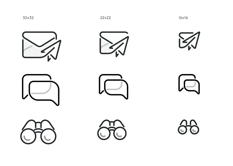
Just to give you an idea of the scale of this particular problem, Oxygen has 719 colourful action icons in the 32×32 size alone. Breeze has roughly 1,200 icons, excluding copies and symbolic links. And I'm not simply scaling the existing artwork down and calling it a day. I'm drawing new versions from scratch for 16×16, 22×22, and 32×32, with 24×24 and 48×48 derived directly from the 22×22 versions.
That's a lot of little pictures.
A LOT. Over 9.000!!!! 🙂
So far, I've made approximately 130 new icons in each of those three sizes. You can follow the work in the symbolicActions directory on KDE Invent. with simlinks and sizes around 1150 new files in the past 4 days...
And each one has to work at its intended size, with its own limitations, proportions, and details. What looks perfectly fine at 32 pixels can turn into a muddy mess at 16. A detail that makes an icon recognisable at one size can become noise at another. Sometimes you have to redraw the thing almost entirely to make it work.
Multiply that by hundreds of icons, and you start to understand why maintaining a theme is such a monumental amount of work. And this is just one part of it.
But there's some good news too! Over in Oxygen Labs, we now have a working prototype of a patch for the KDE settings module (KCM) that lets you choose between symbolic and colourful action icons.
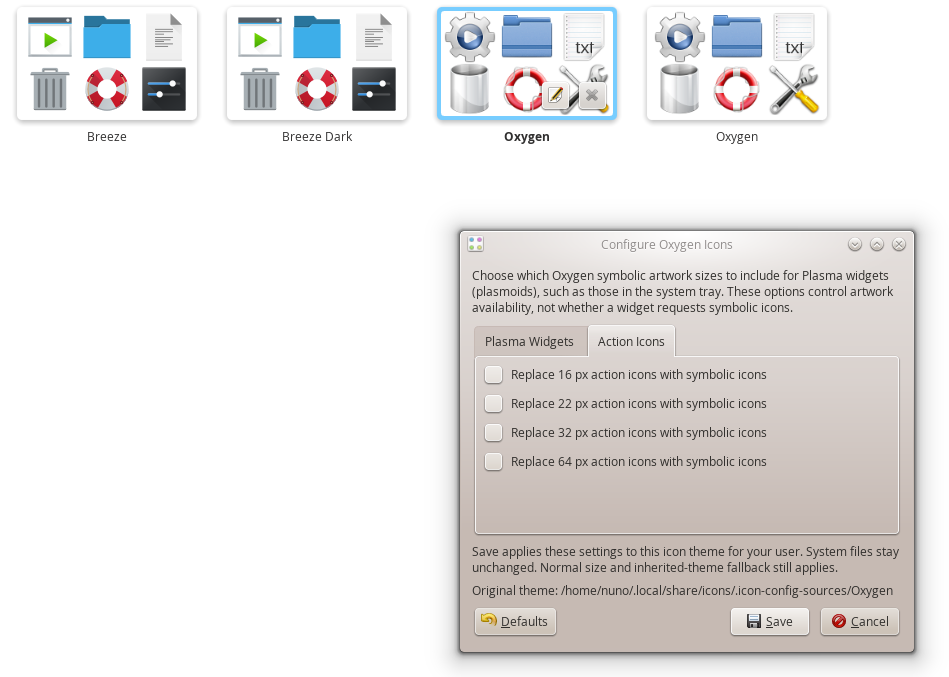
Which is rather the point of all this. 🙂
The user gets Options in the settings. Pick the style you prefer in the size you prefer, hit save, and carry on using your computer. They don't need to know about the hundreds of files, the different sizes, or the months spent adjusting individual shapes. Ideally, it just works.
So why bother?
Because We think user options matter. Even when they seem trivial, even when most people will never touch the setting that is very hiden :D, even when the work required to support them seems completely disproportionate to the little checkbox or dropdown that exposes them.
We all use our computers differently. We have different tastes, different habits, different ideas about what makes an interface comfortable to use. Some people love symbolic icons because they keep the interface quiet and consistent. Others prefer colourful icons because they make actions easier to recognise, or simply because they enjoy having a bit more colour around. And I cant make up my mind as i think it depends :D. Neither is wrong. And if we can offer both without compromising the quality of either, why shouldn't we?
Of course, every option has a cost. Someone has to design it, implement it, test it, and keep it working. In a theme like Oxygen, that cost can be enormous, because an apparently small choice can multiply the amount of artwork that needs to exist and be maintained.
But there is a cost to having no choice as well. It means deciding that everyone should use the same thing, whether it suits them or not. Sometimes that's a perfectly reasonable decision. We can't offer a setting for absolutely everything. But I don't think we should dismiss options just because the work behind them is invisible.
Because apparently, giving people a choice between two kinds of tiny pictures is how I choose to spend my free time. Anyway, there's still plenty to do, but I'm slowly making my way through this rather ridiculous pile of icons. One at a time. on the bright side my daily commits now rival Laurent :D,.... J.K. im only human 😀
On some other news, due to popular demand (all 3 of you) ;(, we are going to make a new video on the qml theming thing, I'm thinking on doing the switch element with a twist ( a literal one ). Wil keep you posted
From the perspective of someone who is visually impaired, and who relies on colour, depth and texture to differentiate between icons far more than symbolic shape, which can often be impossible at small sizes, I wanted to say thank you. Your work matters, you matter, and I’m incredibly grateful for your taking the time to make this happen. It makes a difference more than you know.
🥲
Drawing every size from scratch instead of scaling down is exactly why Oxygen still looks so good, and it is easy to forget how much work hides behind a simple option in the settings. Giving people a choice between symbolic and colourful action icons also helps accessibility, since colour is often what makes a small icon readable. Thank you for taking on hundreds of pixel-level icons, it is great to see Oxygen getting this much care.
🥲 thank you
Redrawing each icon from scratch at 16, 22 and 32 pixels instead of just scaling them down is exactly why Oxygen always looked so crisp. The numbers really show how much hidden work a theme option is: 130 new icons per size and over a thousand files in four days. Looking forward to trying the symbolic action icons once the KCM patch lands.
Thank you very much
A better idea IMO would just be add color to symbolics. One could also add depth. contour and shadow effects – and this part could be configurable. I don’t think full color action icons are viable anymore since no application today is designed with them in mind, so the end result wouldn’t look good in addition to requiring a ton of work.
One area where options would be useful is controlling the color saturation, palette, and possibly the sheen of icons. Let’s say someone wants deeper colors and softer highlights – this would be a very valid use case I think.
they simbolics i have are curently using a few colors, they come from the system color pallete teh main color is the text color
The naive colorization from system accent color can sometimes be problematic because the accent color might just not work for the icons. And why just one color? Why not have a configurable palette that can swap the whole gamut, or control the lightness and saturation of all icons in the theme? This is one area where I think there’s room for configuration.
But full color 3d icons for actions just isn’t worth the effort imo.
One thing at a time… For now I’m doing them in a way that any colour you chose it should be still visible/ readable … Unless the user pick BG colour of windows tha same as text colour and highlighted colour …. But in that case he as more serious problems than the icons
I believe separate option for each icon size is confusing. I’ve been using KDE for over 20 years and frankly I wouldn’t know which one should I select to get symbolic icons in places where Breeze currently uses them, because I have 1920×1080 laptop screen but also 4K external display.
you dont have to use the seting at all if you dont nothing changes, by defoult oxygen will be using the colorfull icons in all sizes… now if you want somthing thiferent you can and you acn even opt to use them in difrent sizes. ;ore poer to the user is a good thing. and this is alradsy a super niche option that most people will never venture in. but if they do 😉 they can…
Hi
I think most icon themes need to draw Icons in each size. However in LibreOffice you can say my icon theme is based on oxygen Icon theme and only some Icons are updated.
So you can offer the user an oxygen Icon pack and an oxygen Icon pack with symbolic Icons or with different folder Layouts, … this is very flexible and offers designers to update only some icons and the icon theme will also look good.
Your spelling is a lot better today…
Today? I do run most of it via one of those ghastly AI thingies, so it’s not my usual spaghetti typo-riddled text. I’m not proud of it ;(. People always got aggravated by my typos ;(
Great work! I love the Oxygen theme dearly. Thank you for putting so much energy and time into it.
🙂 thank you for using it